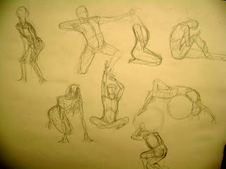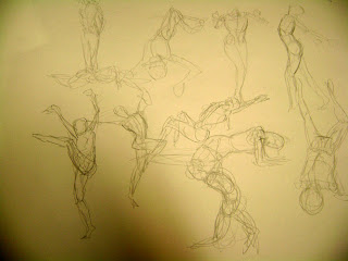
Did some sketching at Kahala mall the other night:
Also started doing some exercises suggested in Design Basics Index, by Jim Krause. The page below is an exercise involving creating small compositions using geometric shapes.
I later tried to take this exercise further and "abstract" magazine ads and layouts into shapes as well:
Shapes are your friends.
Thursday, October 27, 2011
Thursday, October 20, 2011
Purchase Drawing
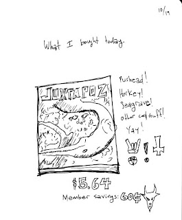
About a week or so ago I bought Kate Bingaman-Burt's book Obsessive Consumption: What Did You Buy Today, in which she includes daily drawings of purchases. I had been meaning to both get the book and start drawing regular, if not daily, purchases since I read about her a year or two ago in ReadyMade magazine. It seemed a good way to get drawings out, especially if I was stuck in the "I don't know what to draw" doldrums. So here's the first of (hopefully) many of these drawings. Still trying to simplify lines, couldn't resist the temptation to retrace lines in the name of "line weight," though.
This month's issue of Juztapoz magazine was curated by Pushead, he of countless Metallica skull graphics, featuring, among others, Aaron Horkey (amazingly intricate ink) and Dan Seagrave (practically every classic death metal album cover). Horns, pentagram, etc. were induced by the giddy metalness of it all.
Monday, October 17, 2011
Hello again. Here are some sketches
Spent a good amount of time on the north shore over the weekend and did some sketches at the beach.
Two above done on October 15. I bought the Bill Sienkiewicz Sketchbook that night and was really impressed by the economy of linework in his ink sketches. He is able to express a lot of his forms using lots of negative space and each of his pen strokes defines a shape, nothing is wasted. Sienkiewicz has a great feel for contour and gesture. He says of sketching: "I often sketch in pen. It forces me to be exact, and if I fuck the sketch up, it screams at me. Not the pen, the sketch. The pen just laughs."
Rocks and island sketched on October 16, trying to be conscious of the use of pen strokes, and making better decisions of separating light from dark.
Wednesday, May 4, 2011
Pictures from LA
I've been sick for the past couple of days, and at first I thought, "hey, what a great time to do some sketching!" and I would have, had I not been in bed feeling like crap. So here are some sketches and pictures from the LA trip. I misplaced my camera at the bottom of my backpack during the Ragnar relay, so I have no race pictures :(.
Sketch of hallway at some church in Temecula, done early as hell in the morning. I was really hyper after running my leg at night, so I spent some time hopping around and stretching before sitting down to draw.
Saw Jordan at Capitol Records
Rhodes
Beatles! blurry like a bigfoot sighting, sadly. We also saw Steve Perry there.
On the plane ride home.
Monday, April 25, 2011
One Rag to Rule Them All
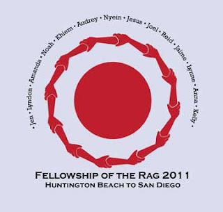
In any case, I collaborated with another teammate on designing the t-shirt for out team, the Fellowship of the Rag. Yes, the name is as juvenile and disgusting as you might think. Our concept was to incorporate joining hands/arms around a red dot, with all the pertinent event information, as well as the names of our runners and volunteers.
I started out sketching some hands and circles, to envision how to set them up:
After determining the sizing and position I wanted for the hands, I put some sketches on the lightbox to get a cleaned up forearm to use as a template in Illustrator. I wanted to get the pencil work pretty clean before getting to the computer, to reduce guess-work:
I traced the forearm and hand as separate shapes to be able to change the angle at the wrist:
Since we were going for a 2-color print, I wanted to make the elements simple and readable. To this end, I made sure to leave gaps between the fingers, so they would read better:
Once I had the hand and arm positioned relative to eachother, I joined them into a single shape with the pathfinder tool in Illustrator.
Then it was a matter of pasting copies of the forearm, each rotated 30 degrees, to make a circle of 12 arms.
Then text was added for the runner and volunteer names, as well as the team name.
Pretty quick from start to finish and I'm already getting ideas to work in next year.
Monday, November 8, 2010
Working on Anatomy/People
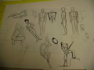
Lately I've been trying to work on gestures, anatomy, and general figure drawing. When I've tried this in the past, I always get stuck in the middle of a Loomis book (free downloads of these at Escape From Illustration Island in the link) or some anatomy text and just draw one or two static pictures and call it a day. Not terribly effective.
My current strategy is to play to my ADD and go to multiple sources. I've been reading digested/simplified anatomy at two blogs geared towards animation: Rad Sechrist's Rad How-To and Kris Anka's Design Lessons. Both of these break down more traditional anatomy and figure drawing basics into practical chunks.
I go back and forth between these blogs and Loomis's Figure Drawing For All It's Worth to get proportions, forms, and muscle relation studies, and then jump over to Pixelovely's Gesture Drawing Tool for practice with timed pictures (warning: nekkid people). Rinse and repeat. There are also some neat references at Posemaniacs, though all the models are generated by computer and can seem awkward.
In any case, I hope to get a better grip on drawing fluid, lifelike poses out of this.
Wednesday, October 13, 2010
Recent Work
Here are some models and renderings I did recently for Honolulu-based interior design company Retail Therapy. These models are of a proposed cell phone store somewhere in town. I'll update when the store is done.
Subscribe to:
Posts (Atom)